

At times, there's nothing inherently wrong with the design and printing of a client's collateral material but a few modifications can create a fresher, more improved look.
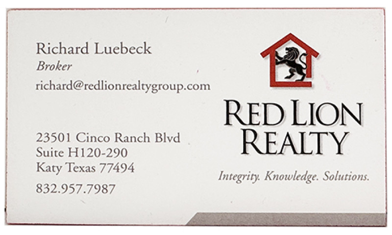
Richard Luebeck of Red Lion Realty contacted Page by Page to order business cards. He was interested in the premium line which offers many options for paper stocks, thicknesses, coatings, and add-ons. Currently, his cards were printed on double-thick, 32 pt uncoated paper stock with red colored edges. He's used the same design for a while and I had a few ideas on how to enhance the look (and feel) of his business cards.
Richard was open to seeing what I could do with the business card design. There were a few things that came to mind immediately: the print he was using was a light gray and the text was hard to read. The phone number blended in at the bottom of the address block and wasn't as prominent as it should have been. The other thing I wanted to focus on, besides the text, was the logo.
His current cards stressed the company name over the logo and the logo was sized smaller than I thought it should be. Additionally, there were a few things I wanted to present to Richard regarding slight modifications to the logo itself which is a lion completely inside the outline of a house.
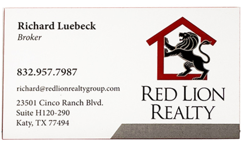
The first thing I did to the logo was remove the right side of the house outline and enlarge the lion, having him stepping into the house. I wanted to convey "out of the box" thinking, rather than keeping the lion trapped in the house.
I then enlarged the logo on the business card, making it a focal point for branding purposes. I kept the company name large and in better proportion to the logo.
I changed the text color to a darker gray which is much easier to read. I also repositioned the order of the information, separating the phone number from the text block and moving the email address below the phone number rather than directly under Richard's name and title. Since those are the two most important pieces of contact information, they work better in the new position. Richard's name and title are now isolated and more noticeable and the email address doesn't detract from either the name, the title, or the logo, where before, it encroached into the logo space.
Finally, we maintained the same back of the card but added a tagline. We retained the red colored edges and changed the paper stock to 32 pt Silk which give a very smooth finish instead of the prior uncoated stock. I also used embossing and Spot UV gloss on the logo for added appeal. All of this together enhances how his company will be perceived by his clients and prospects.
We appreciate having had the opportunity to work with Richard on this project and are grateful he allowed suggestions to be made to his branding and design! A full photo of his new cards can be seen in the Page by Page Gallery: https://www.pagebypageweb.com/portfolio/gallery
Contact Details
Page by Page Graphic Design and Printing LLC
Fulshear, Texas 77441
Phone : 281-703-1040
Fax : 832-363-1744
Email : carey@pagebypageweb.com
Our Social Media Presence

